
White and black, light and dark – we all know what it means to create contrast in your home, but does it always have to be such a stark difference? Can you create contrast without committing to opposite ends of the spectrum? The answer – of course! Although there is a time and place for strong contrast, there are many ways to create variation and interest in a space in a more subtle manner. And there are more opportunities to create contrast beyond colors. Let’s examine a few ways to design an impactful and dynamic home.
Explore Textures
Texture takes many forms and can evoke different feelings. Organic or natural materials can create a cozier space while items with a smooth texture lend themselves to a sleeker look. Texture offers both a tactile and visual experience. When two textures – bumpy and smooth, for instance – are paired, it gives certain details visual weight and offers variation without becoming distracting or overwhelming.
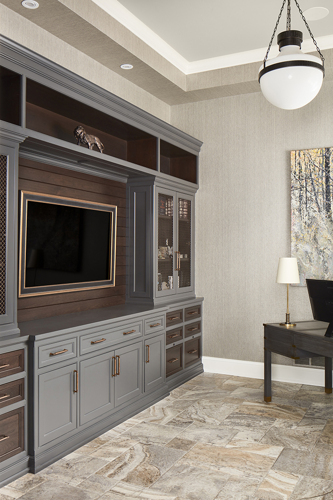
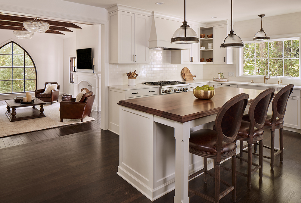
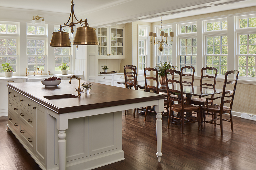
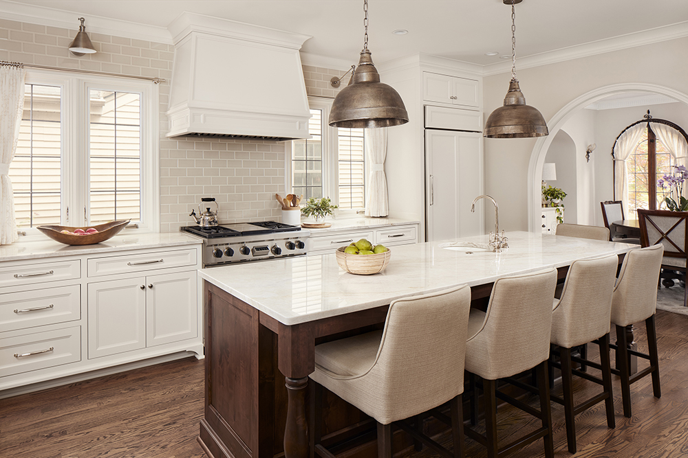
Select Distinct Materials
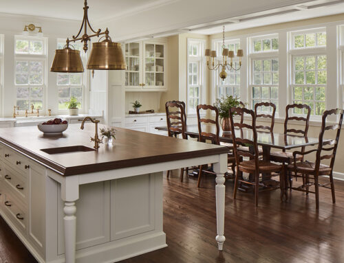
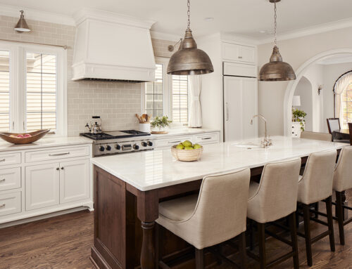
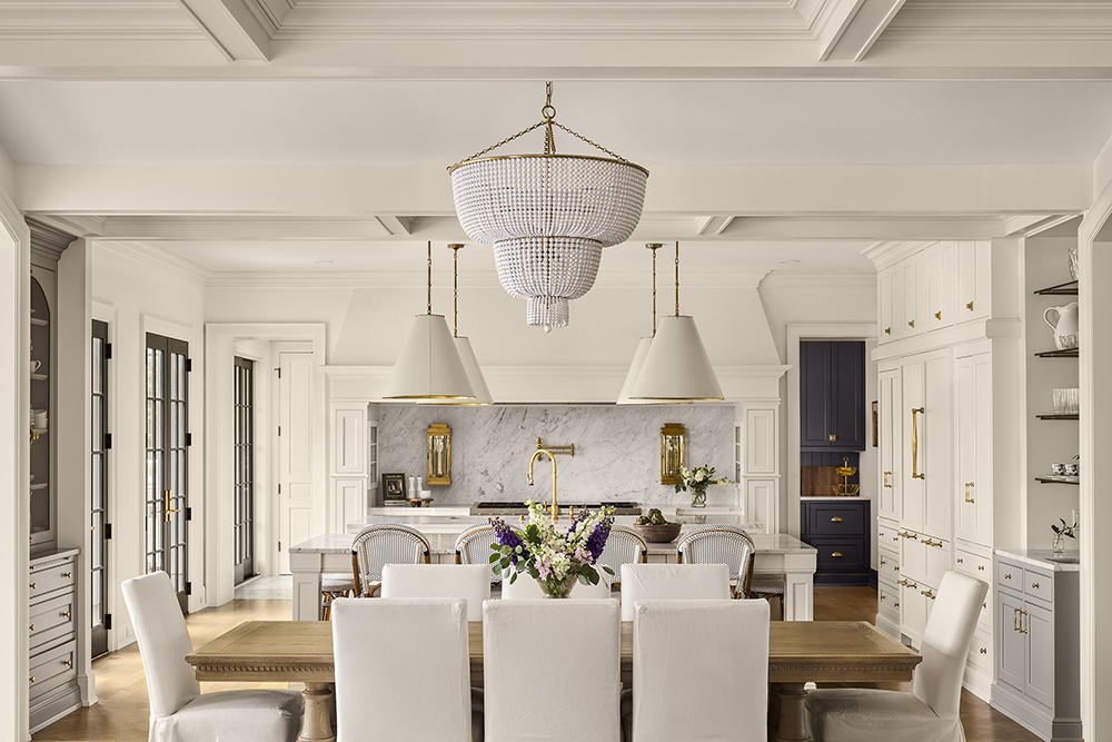
It’s inevitable that a room will include various materials, but if one is intentional with their selections, they can create contrast, architectural detail and style with the juxtaposition of different materials. Mix natural elements like wood and stone with metals such as brass or nickel. Pair a glazed tile with a honed countertop. Combine sharp angles with softer edges. Incorporate both old and new items. Pieces with patina, distress marks, rough edges and faded stains are a beautiful contrast to new materials, adding charm and avoiding a “cookie-cutter” design.
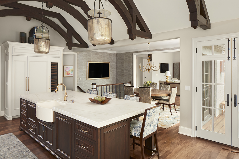
Consider Wall or Ceiling Treatments
Wood paneling, shiplap, wallpaper, reclaimed wood, tile – there are many wall and ceiling options to create contrast and add a layer of detail and character to a space. Perhaps, a room with wood paneling or a ceiling with beams breaks up a sea of drywall. Or maybe you decide to pair two different wall treatments – wallpaper and wainscoting – to elevate a space.
Use Tone on Tone
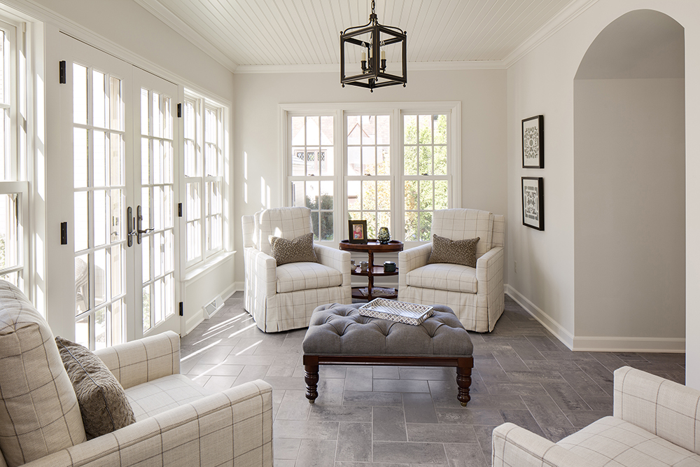
A monochromatic space doesn’t have to be devoid of contrast. For instance, if you have white walls and white trim, create variation with different sheens. Perhaps, you use a satin paint color on the wall and a semi-gloss paint on the trim. Or a matte finish with a satin finish. You could also choose colors that are slightly different in the color spectrum to create contrast.
Include Negative and Positive Space
Lastly, we should not forget the power of creating contrast with empty space. It can be quite impactful to combine positive space – an area that’s taken up with “stuff” and draws our attention – with negative space which gives the eye a break. This combination offers visual balance.

Leave A Comment