
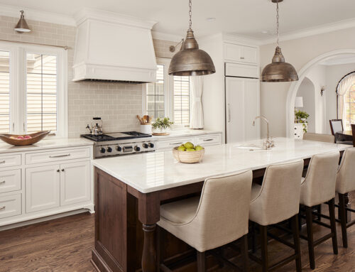
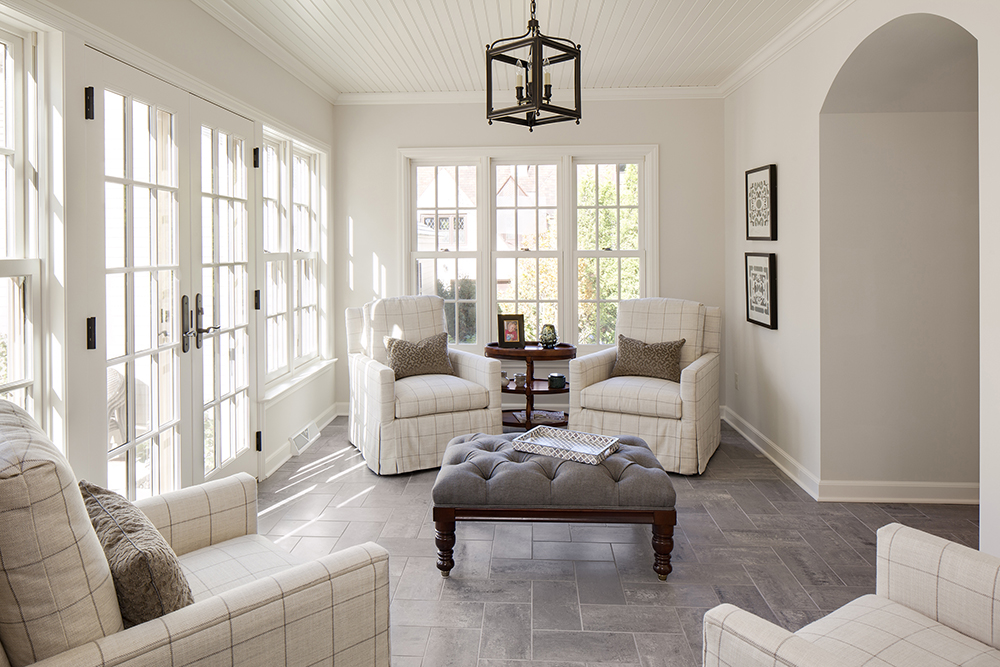
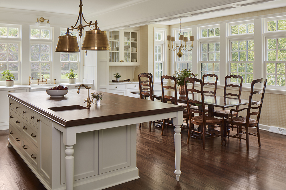
There is no denying the popularity and appeal of a light and airy space bathed in whites, creams and light grays, but there is definitely a shift occurring. It seems that more homeowners are starting to embrace color and the deeper hues of the spectrum. Oftentimes, they are not incorporating dramatic colors throughout their entire home, but homeowners are using a moody aesthetic in small spaces or corners to add contrast, sophistication and depth. Bartelt. The Remodeling Resource explores where and why you may want to consider mixing darker colors into your home’s design.
What Do We Mean By Moody?
Let’s start with some misconceptions when it comes to spaces with a darker palette. Moody is not necessarily synonymous with black. Really, any rich color or jewel tone can be used to achieve that obscure, moody aesthetic that so many people are inserting into their homes. Moody also doesn’t have to mean dark or dreary, which can be a concern for individuals as they contemplate their home’s color scheme. When we talk about moody spaces, we’re referring to rooms and nooks that use deep, saturated colors to set the tone for a space. Maybe you’re looking for drama? Perhaps, you want a sense of calm? Or you may think that darker hues are cozier? Whatever your reason, dark colors have a lot to offer and can tie in with any style.
Why Should I Consider Dark Hues?
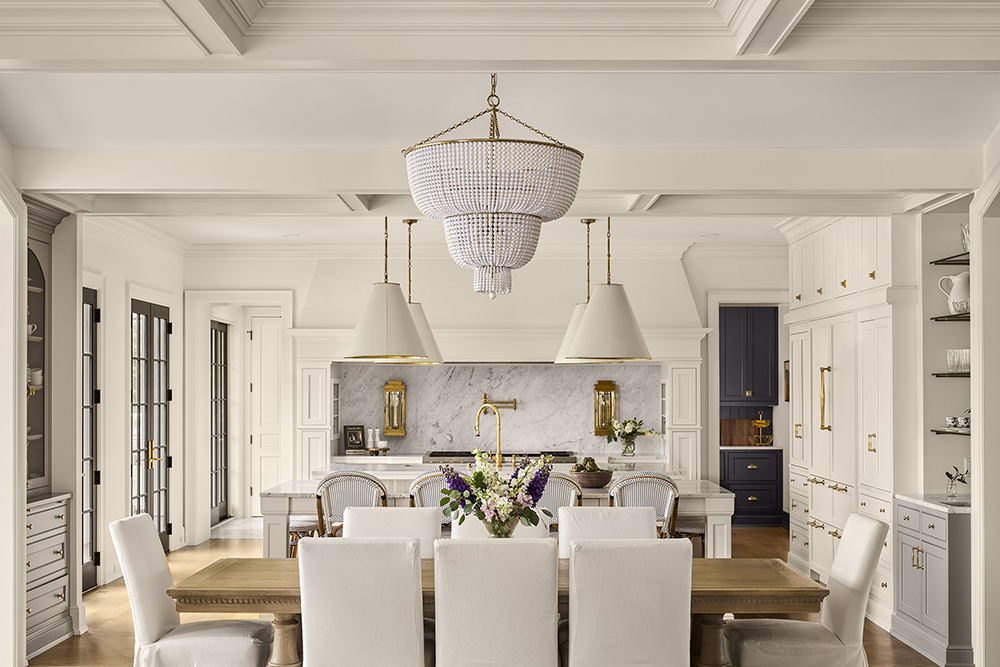
We’ve touched on the feelings that inkier colors can evoke – relaxation, elegance, intimacy. But it can also be a powerful design tool. Darker colors are a great way to showcase other elements whether it be an architectural detail, lighting, artwork or furniture. Pieces tend to “pop” against a darker or monochromatic palette. It is also a great opportunity to create a focal point. For instance, some people will opt for a moody wet bar or built-ins in an otherwise lighter room to really command attention. Bold hues can also ground a space, which can be helpful in an expansive area.

Where Should I Use a Deeper Palette?
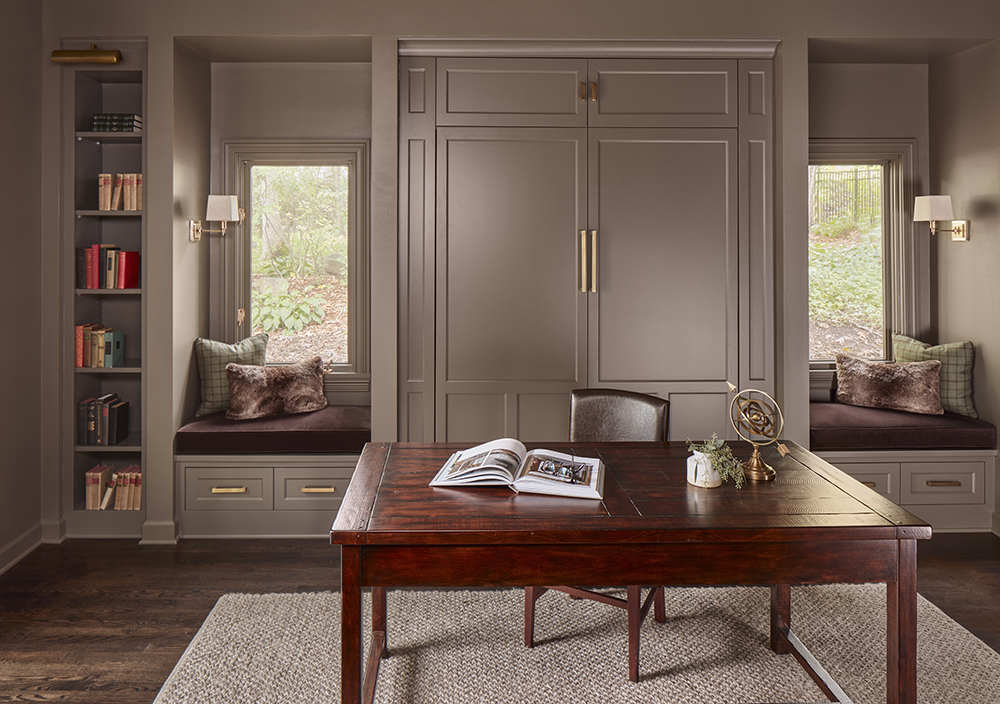
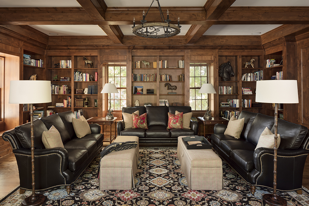
A moody color scheme can work in any space that you’re willing to take a risk. But we often see it used in smaller spaces, such as powder rooms. Surprisingly, this can actually make a room feel larger because it takes the emphasis off the placement of the walls, drawing attention to other details. It’s also common in bedrooms to create a calm environment, perfect to relax in at the end of the day. Libraries or home offices are another great opportunity for that moodier look. People often desire a sense of grounding or peace when they need to concentrate on a book or work. Of course, it is not uncommon to use darker shades in a home theater or lower level, too.
How Can I Balance a Moody Space?
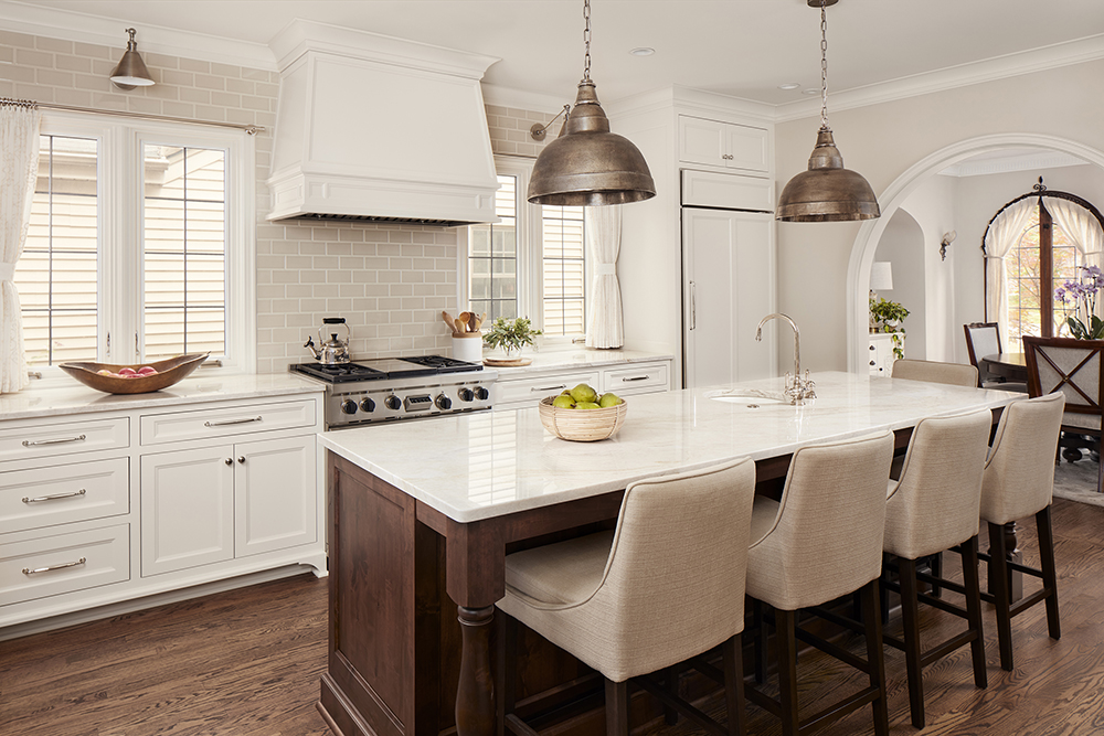
Even with all that darker colors have to offer, it can be intimidating to use them in your home. It’s all about balance and good design. Bold colors often pair well with natural textures and elements – marble, wood, concrete, metals. Lighting is also an important component. Natural light can play a huge role in the success of a moody space, creating pockets of light and the perfect shadowing. When natural light isn’t an option, be sure to include layers of light with task lighting, dimmers, and in- and under-cabinet lighting to really create an ambience. Use textures to introduce character and subtle contrast. Try to incorporate lighter hues with furniture, accessories and textiles.

Leave A Comment